
TL;DR
Livingetc published a guide to five Japanese color references that designer Yoko Kloeden says can make minimalist rooms feel warmer: susutake-iro, shiracha, rikyū-nezu, kyō-sabi and tsuchikabe. The guidance focuses on warm undertones and matte, textured finishes; it is design advice, not a report of measured effects.
Livingetc has published a guide to five Japanese wall-color references that interior designer Yoko Kloeden says can give minimalist rooms a warmer feel. The selections range from tea-toned off-white to muted green-gray and clay brown, with the advice centered on choosing warm undertones rather than blue- or black-based neutrals.

Get cleaning gear delivered free with Prime
- Fast, free delivery on millions of items
- Prime Video, Amazon Music and more included
- Member-only deals all year
The five colors are susutake-iro, a smoky brown-black; shiracha, a very light brown that can read as warm off-white; rikyū-nezu, a green-tinged gray; kyō-sabi, a muted red-brown; and tsuchikabe, a settled mid-brown associated with traditional clay walls. The article presents them as references for contemporary paint choices, not as a standardized paint chart.
Kloeden says the common thread is the presence of yellow, red or green undertones, rather than blue. She describes susutake-iro as resembling old bamboo darkened by smoke, while shiracha is like white tea with milk. Rikyū-nezu draws on sage and lichen; kyō-sabi resembles muted terracotta; and tsuchikabe refers to clay mixed with chopped straw and sand.
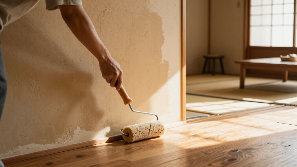
The report suggests comparable modern paint shades, including Little Greene Attic II and Ambleside, and Farrow & Ball shades such as Stirabout, Dead Salmon and Mouse’s Back. Kloeden also recommends matte paint, limewash or clay plaster for surface variation. The named products are examples in the article; the source does not establish exact matches between these paints and the traditional color references.
How Undertones Change a Room
The guide offers readers a practical way to narrow neutral paint choices: pay attention to the undertone, not just whether a color is called white, gray or brown. Kloeden’s point is that a pale neutral with brown warmth can feel different from one cooled with blue or black, while a green-gray may retain a softer character than a blue-gray, particularly in a north-facing room.
That distinction matters for people choosing colors for minimalist interiors, where large uninterrupted wall areas make subtle color differences more visible. The article also connects finish to perception: matte surfaces and textured lime or clay coatings can create changes in how a wall looks as light shifts. These are design judgments from Kloeden, not findings from a controlled study, and a shade’s appearance will depend on lighting, furnishings and the specific product.
Products Worth Considering

Levoit Vital 100S-P Air Purifier with Washable Pre-Filter

eufy C28 Robot Vacuum and Mop Combo with HydroJet Roller, 15,000 Pa Suction, and Self-Emptying Station

Sonos Era 100 Wireless Smart Speaker with Alexa, Black
As an affiliate, we earn on qualifying purchases.
From Traditional Materials to Paint
The colors in the report are tied to Japanese materials and place-based references, rather than presented simply as a current trend. Susutake-iro refers to bamboo darkened over time by hearth smoke. Kyō-sabi is described as clay from Fukakusa in southern Kyoto, and tsuchikabe refers to clay wall construction using local earth, straw and sand. Kloeden says juraku clay is a well-known Kyoto example and that the source material is now scarce because the city has covered the ground where it was found.
For modern interiors, Livingetc translates those references into suggested commercial shades. That translation is interpretive: natural materials vary, and the article does not claim that a specific paint reproduces the original clay or bamboo exactly. Kloeden is identified as the founder of a London architecture and interior-design studio that works with Japanese aesthetics and natural materials.
“The Japanese wall colors that warm a minimalist room are all earth colors, and none of them have blue in them.”
— Yoko Kloeden, interior designer, quoted by Livingetc
How Each Shade Will Read
The report does not provide independent testing or measured evidence that these colors make rooms feel warmer. That description is Kloeden’s design assessment. It also does not specify a single formulation or universal color value for each traditional term, and it gives no guarantee that a suggested commercial paint will look the same in every home.
Actual appearance may vary with daylight direction, artificial lighting, wall texture and surrounding colors. The source does not state the article’s publication date in the supplied material, nor does it give product availability or current pricing. Readers would need to check paint samples in their own space before choosing a shade.
Test Samples in Your Light
The report does not announce a forthcoming product launch or event. Its practical next step for readers is to use the five references as a starting point, then compare paint samples on the intended walls under both daylight and evening lighting. The article’s suggested commercial shades can help guide that search, but they are not presented as exact reproductions.
Anyone considering limewash or clay plaster should also check the preparation and application requirements for the chosen product. The source offers design recommendations rather than a renovation specification, so further details would depend on the product and the room.
Key Questions
Which five Japanese-inspired colors does the report recommend?
It covers susutake-iro, shiracha, rikyū-nezu, kyō-sabi and tsuchikabe, described respectively as smoky brown-black, warm tea-like off-white, green-gray, muted red-brown and mid-brown.
What makes these colors feel warmer, according to Yoko Kloeden?
Kloeden says the palette uses yellow, red or green undertones rather than blue. This is her design guidance, not a measured claim that every room will feel warmer.
Are the suggested paint shades exact matches?
No exact equivalence is established. Livingetc names several commercial shades as examples or approximations; traditional materials and colors can vary, and paint appearance depends on the room.
How can I check how a shade will look at home?
Test samples on the intended wall and observe them in daylight and artificial light. The article notes that some colors, including shiracha, can shift in appearance between those conditions.
Source: livingetc.com